This post is taken from a collection of Trellis Help Docs that we’ve written for Trellis users, but these steps are not unique to Trellis themes. These are the same steps you would take to upload any plugins to your WordPress site.
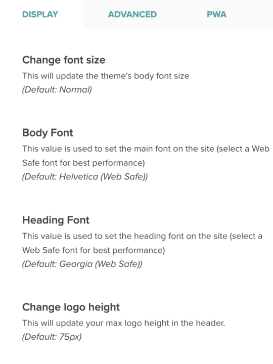
When Trellis is the active theme, you can find these settings by logging into your WordPress site and navigating to Appearance → Mediavine Trellis → Display
Change Font Size
This will update your theme’s body font size with one of the four options you select. The body font refers to the overall text used throughout the site, but does not refer to headings.
The default setting for the body font size is 18px.
Body Font
This value is used to set the main body font that will display on the site. The body font refers to the overall paragraph text used throughout the site, but does not refer to headings.
A selection of Google fonts and web-safe fonts are built into Trellis Core. Choose a web-safe font for best performance.
Heading Font
This value is used to set the heading font on the site (H1-H6).
A selection of Google fonts and web-safe are built into Trellis Core. Choose a web-safe font for best performance.
Change Logo Height
This will update the maximum logo height in the header. The actual logo height might be limited by the width of your logo. If the setting doesn’t appear to be changing the logo height, it might be due to the logo width being restricted to allow space for the main navigation in the header.
Layout Space
This will update the space around page elements.
The space around elements refers to padding and margins between objects on the page. There are three options here:
- Comfortable (more space)
- Cozy (default space)
- Compact (less space)
Choose Compact if you want to see more content above the fold. Choose Comfortable if you want a little more breathing room for your content.
Primary Color
This will set the color of some primary theme features like links, buttons and other elements. Choose one of the defaults from the dropdown menu, or enter your six-digit color hex code.
The hover state of these elements will be determined by your Secondary color selection.
Secondary Color
This will set the color of some secondary theme features like hover effects, alternate buttons and other elements.
Choose one of the defaults from the dropdown menu, or enter your six-digit color hex code.
Post Meta Date Display
This value will determine which date to display in the post header. The Post Meta Date will display in the post header container. The user can display Date Modified, Date Published, or both Date Modified and Date Published.
Meta tags for both Date Modified and Date Published will be added to the <head> of the document regardless of the setting.
Enable Search Bar
Enabling this adds a search bar to the site header. The search icon will display inline with the main navigation. When clicked, the search field will display in the header.
Site Logo
This setting will determine what image is used as your logo in the site header.
We recommend using .jpg, .png. or .svg formats. Use .svg for best display and performance.
Featured Image Size
This setting will select which featured image crop to use on the homepage and article feed pages. There is no wrong answer here; experiment and decide which crop works best for your images.
– Trellis Square: Square
– Trellis 3×4 : Portrait
– Trellis 4×3: Landscape
– Trellis 16×9: Wide landscape